
How to Turn Clicks Into Customers With Smarter Landing Pages
Ever clicked on a landing page and immediately bounced because it felt like it was built by someone who’s never used the internet? That’s most landing pages. And it’s a shame, because when you get one right, it works like a digital salesperson that doesn’t eat, sleep, or ask for a raise.
The goal is simple: take a distracted visitor and guide them to take one specific action. Here's how to do that in a way that feels natural, personal, and actually gets results.
Start With a Clear Headline
This is your first and best shot at grabbing someone’s attention. It should say exactly what the offer is, why it matters, and why they should care. Avoid trying to be clever. Be useful instead.
For example: “Double Your Email List in 30 Days” says a lot more than “Unlock the Power of Growth.”
Clarity wins. Always.
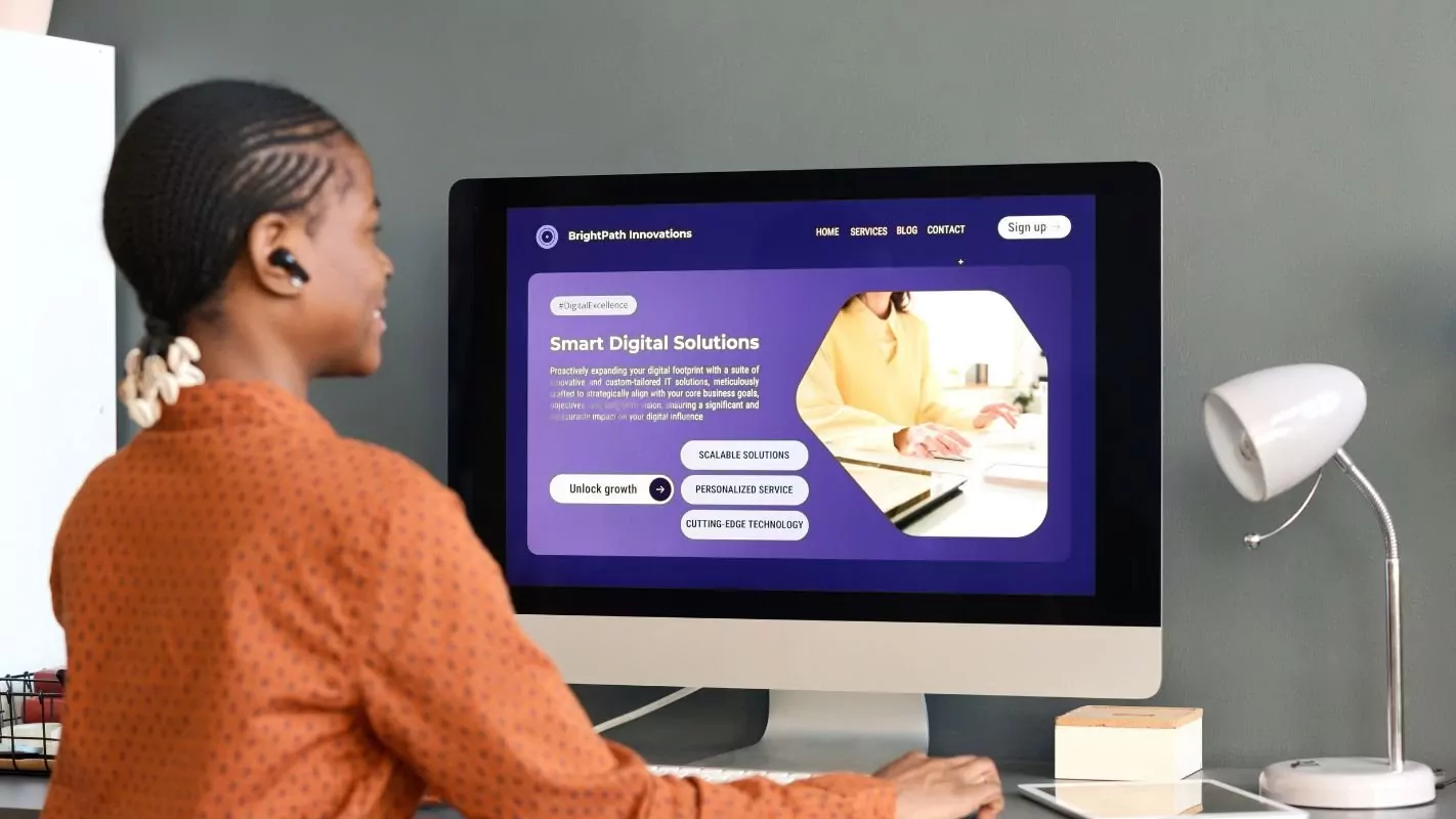
Use Visuals That Reinforce the Message
Images aren’t decoration. They’re proof. If you’re offering a tool, show it in action. If it’s a service, show someone getting the result. And if you’re using a video, keep it tight and focused. People skim, so the visuals should tell the story even if they don’t read a word.
Write Like You're Talking to a Real Person
Nobody wants to read a brochure. Your copy should sound like you’re explaining something to a friend over coffee. Cut the corporate tone. Say what you mean. Get to the point.
Don’t sell the features. Show the outcomes. Instead of “AI-driven analytics dashboard,” say “See exactly what’s working in your business, without digging through spreadsheets.”
Make Your Call to Action Obvious
The CTA is where the magic happens. It should be loud, clear, and action-focused. If the button says “Submit,” you’re losing people. Try “Start My Free Trial” or “Send Me the Guide.” Be specific about what happens when they click.
Design-wise, the button should stand out. Don’t make people hunt for it.
Build Trust Fast
If someone’s hesitating, it’s usually because they’re not sure they can trust you. So give them reasons to. Testimonials from real people, logos of companies you’ve worked with, review scores, security badges if you’re asking for payment—all of this helps.
Social proof is powerful, but only when it’s real. Don’t fake it.
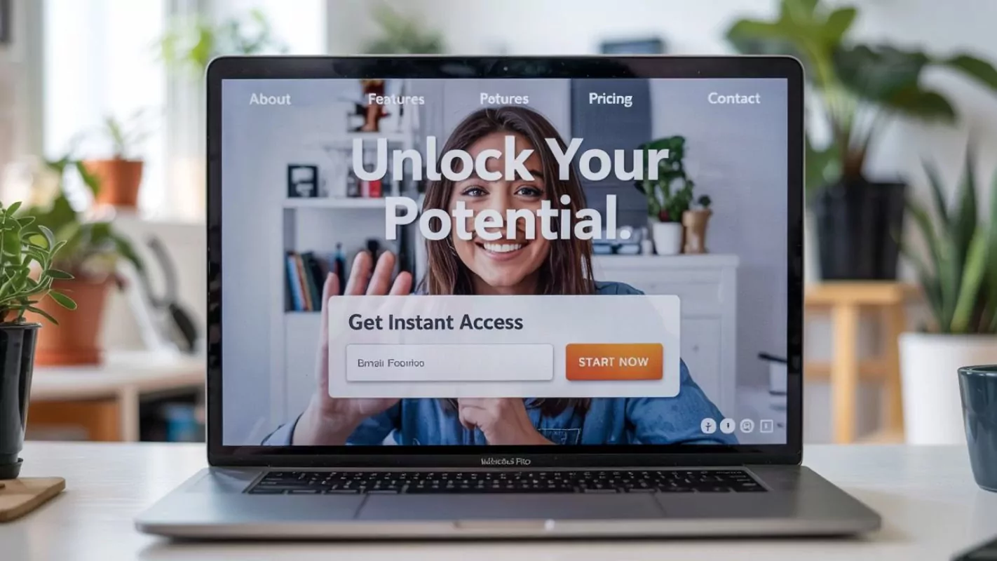
Keep Forms Short and Sweet
The more you ask for, the more people drop off. Stick to what you need. If it’s an email list, just ask for the email. Name and email is usually fine. Only ask for more if you can explain why it matters.
If you want to learn more about them later, do it through follow-up, not on the first date.
Design for Mobile First
Most of your visitors are on their phones. If the page is hard to scroll, takes forever to load, or breaks the layout, they’re gone. You won’t get a second chance.
Make sure buttons are big enough to tap. Fonts are readable. Forms are easy. This one’s non-negotiable.
Test Everything
Your first version won’t be perfect. And that’s fine. The key is to test it. Change one thing at a time. Try different headlines, images, or button text. See what gets more clicks. Data is your feedback loop.
It’s not about guessing. It’s about listening to what your audience is telling you with their actions.
Don’t Waste the Thank You Page
Someone just took action. That’s momentum. Keep it going.
Use the thank you page to offer something else. Could be a free resource, a follow-up call, or a chance to connect on social. Don’t just say thanks. Give them a next step.
Watch Your Metrics and Adjust
Track conversion rates, bounce rates, scroll depth—anything that shows how people are using the page. If something isn’t working, dig into why. A weak headline, slow load time, or long form can all kill conversions.
Make changes based on real numbers, not gut feelings.
That’s it. No gimmicks. No fluff. Just a landing page built to do its job.
